Contents:
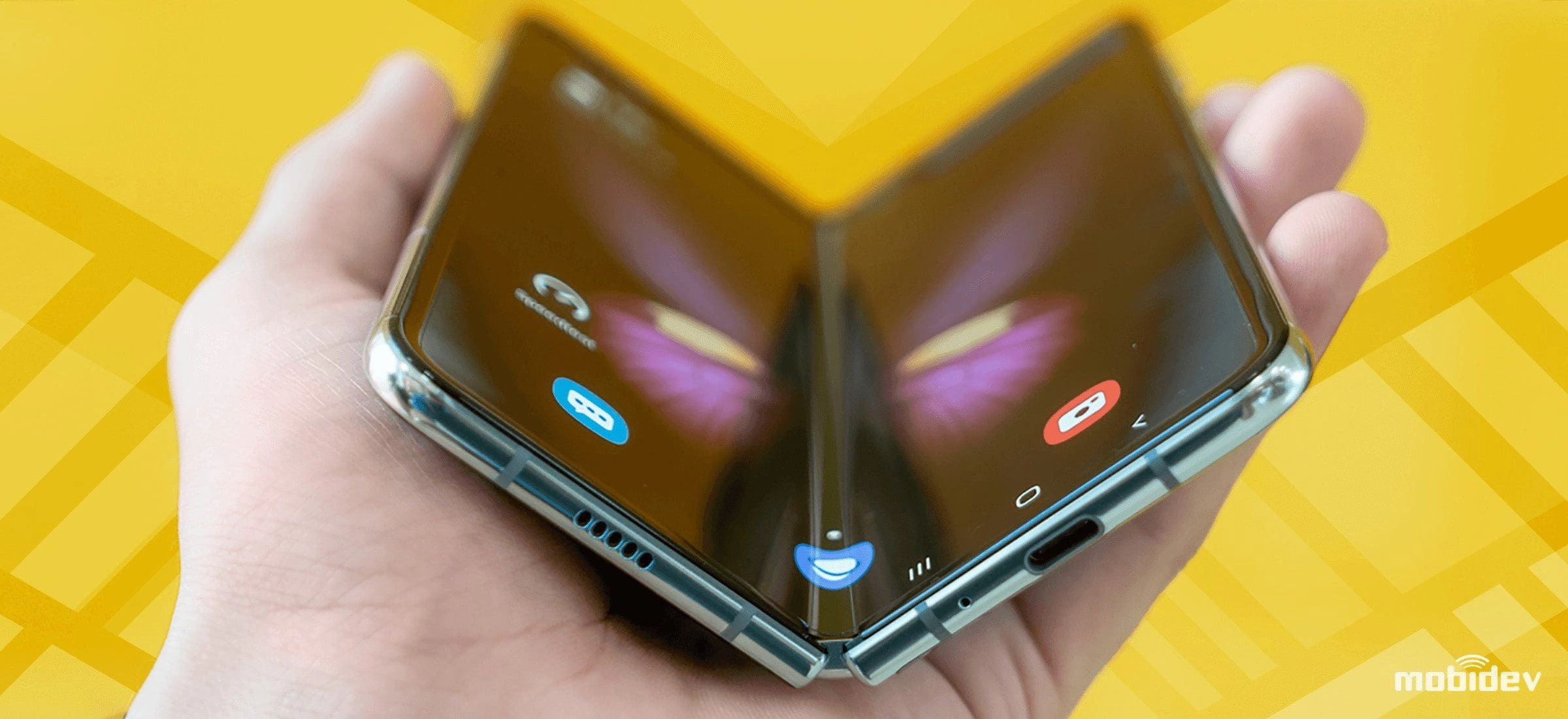
The resurgence of interest in foldable smartphones has created fresh possibilities for brands to engage with their users. If you’re considering expanding the features of your application to multiple screens, you’re likely looking for ways to make this process as smooth as possible for both the company and end users. This article aims to provide you with insights into what it takes to develop Android applications for multi-screen devices, encompassing both the development and business aspects of these projects.
How to Create a Multi-Screen App on Android
Jetpack WindowManager has significantly simplified the development of applications for foldable devices. This library enables Android app developers to support multi-window environments, track screens, their quantity, state, and visibility zones.
In general, Jetpack WindowManager may help to adapt an application for a foldable device by analyzing the screen state and applying the appropriate design.
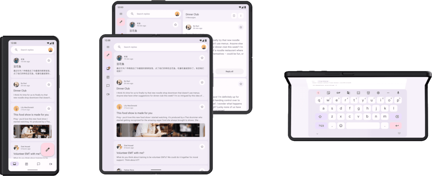
Foldable smartphones have three states – folded, flat, and half-opened. In the folded state, the device appears like a regular smartphone or tablet. Users interact with the smartphone as they would with any other device, with no noticeable difference in features. In the unfolded state, a regular smartphone transforms into a large-screen device. The additional space provides an immersive experience but may pose challenges for feature development.
Understanding and managing these states is crucial for adapting an application to the unique characteristics of foldable devices.
Folded, open flat, open flat rotated to landscape, and half-opened (tabletop) modes (Source: Android for developers)
When users launch an app on their foldable smartphones, we don’t know the specific position of the device – whether it’s flipped, flat, or half-open. The app needs to detect the screen state and dynamically switch modes. Moreover, if the app is opened in tablet mode, it should remain in tablet mode. And when the user transitions to a different mode, the design should adapt accordingly. The app should be able to seamlessly adjust to various screen positions for a smooth user experience.
To optimize an app for foldable screens with Jetpack WindowManager, you can tap into the official documentation. The stable release version of Jetpack WindowManager contains important features:
- WindowMetricsCalculator: This interface calculates the WindowMetrics for an Activity, determining the dimensions and position of the window when set to MATCH_PARENT width and height.
- WindowInfoTracker: Offers WindowLayoutInfo, a representation of display characteristics observable through types like Flow or RxJava.
- WindowLayoutInfo: Holds display features that help differentiate whether a window spans a fold or hinge.
- FoldingFeature: Allows monitoring of the folded state on foldable devices for determining device postures ( test APIs for creating a FoldingFeature were stabilized in the last release).
Jetpack WindowManager not only helps to create apps for foldable devices from the ground up but allows for adapting existing products.From a development standpoint, adapting for foldables will add some extra time. If we’re talking about developing an application from scratch, it’s approximately 15-20%. Adapting an existing application needs to be calculated individually because much depends on how the application was originally developed; outdated code may require refactoring and modernization.
Key Considerations When Building Apps for Foldable Mobile Devices
Optimizing your product for foldable mobile devices makes sense only if it brings significant benefits to users and aligns with your budget. When building an app for foldable devices, you need to consider the following factors.
1. UX/UI Design
The main part of creating an application for multi-screen and foldable devices is working on the design. The design needs to be adapted for various screen sizes, but not necessarily for all screens. Only elements that can be truly adapted and provide benefits to users should be redesigned.
For instance, most users operate their smartphones with one hand. In the unfolded state, interaction will require the use of both hands. Therefore, the placement of user interface elements should be adjusted accordingly. This is relevant for applications like email clients, where you can extend the keyboard to a separate screen in flat mode, creating a laptop-like experience.
Also, you need to ensure that the app’s user interface can scale and reflow content appropriately when the device is folded or unfolded. Consider applying responsive design principles to dynamically adjust layouts.
Make the most of the foldable device’s resizable screen by adapting UI elements based on the available screen space. This can improve the user experience and maximize the larger display when the device is unfolded.
Take into account that new gestures and interactions specific to foldable devices should be thoroughly explored before crafting UX/UI design. For example, users can swipe from one screen to another or drag content across screens. Design intuitive gestures to enhance the user experience and make interactions with the device feel natural.
In addition, don’t forget about providing visual cues to help users understand the folding capabilities and current screen configuration. Use animations, icons, or subtle indicators to show the fold position and device state.
2. App Continuity
App Continuity enables a smooth transition between different states of an app when using a foldable device. This feature ensures that the app adjusts to the new screen configuration without disrupting the user experience. For instance, if someone is using your app on one screen and then unfolds the device, the app should seamlessly continue its operation on the larger screen without any interruption.
To make this happen, you’ll need to implement the necessary logic to handle configuration changes triggered by folding or unfolding the device. These changes should be detected through the provided APIs to update the app’s UI, layout, and resources accordingly. This might involve repositioning UI elements, resizing images, or adapting the app’s navigation structure.
Make sure that your app retains its state when transitioning between folded and unfolded states. By saving relevant data, user inputs, and the current screen position, you’ll be able to restore the app exactly where the user left off, ensuring a seamless experience without any loss of context.
Both designers and developers should collaborate to implement app continuity and provide users with the most comfortable experience within the capabilities of the chosen technologies.
3. Multi-Window and Multi-Tasking
Foldable mobile devices often support multi-window and multitasking, allowing users to run multiple apps simultaneously. Design your app to make the most of this feature, enabling users to use it alongside other apps in split-screen or multi-window mode.
As we discussed earlier, adapt your app’s design to various window sizes and aspect ratios using Jetpack WindowManager for easy support of multi-window mode. Here are additional tips:
- Define how your app handles user focus and interaction when multiple windows are active. Decide which window should have input focus and how actions in one window may affect others. Ensure that user interactions like taps, swipes, or gestures are correctly directed to the relevant window.
- Enable sharing of data and context between multiple app instances or windows. Consider scenarios where users may want to drag and drop content, copy-paste information, or share data between different windows. Implement the necessary mechanisms to facilitate these interactions for a consistent user experience.
- Preserve your app’s state when users switch between windows or minimize/maximize app instances. Save relevant data and user inputs so that when a window is reactivated, the app can accurately restore its previous state. This ensures a seamless multitasking experience without any loss of context.
4. Testing
Testing apps for foldable mobile devices requires a special approach to ensure they work well and provide a smooth user experience. First and foremost, use actual foldable devices for testing. Emulators or simulators may not accurately mimic the unique features of foldable device hardware and software.
Testing strategies for foldable devices involves considerations like multi-window compatibility, resizing, response time, consistent layouts, support for multiple aspect ratios, screen quality, memory, and battery consumption.
Additional test scenarios include app launching, camera functionality, media testing, UI component alignment, data entry, app switching, and orientation of the fold. Testing in this case is associated with numerous–for example, high device costs, increased development effort, and the need for re-testing due to changing screen conditions.
In conclusion, developing applications for foldable devices requires an extension of existing mobile app testing processes to ensure a seamless user experience.
How MobiDev Can Help You Develop a Mobile App Compatible with Foldable Devices
With more than 14 years of experience in mobile application development, the MobiDev team can undertake projects of any complexity and easily build applications for foldable and dual-screen devices. Expertise in developing native Android, iOS, and cross-platform applications allows us to accurately assess customer needs and implement the project following your tech and business requirements.
